What to Wear for a San Diego Beach Photo Session
What Should We Wear?
The most frequently asked question we get is, “What should we wear?” And oh boy, do we understand this one. Whenever we’re getting ready for our own family photos or a branding session for ourselves, this is where we spend most of our prep energy.
That’s not to say we want you to do the same! We just completely understand how stressful figuring out outfits can feel.
So while the advice below comes from more than a decade of photographing and editing family beach sessions, we also want you to know that it is just that: advice. Ultimately, the most important thing is that you feel comfortable and happy in what you’re wearing.
Ideally, when you look back at these photos, you won’t be thinking about your clothes anyway. You’ll remember the fun, the little interactions with your favorite people, the sunlight, the waves, and how it felt to be together. Your outfits should help draw your eye toward that closeness—not distract from it.
Pick a Palette, Don’t Match
Matching can be super cute in life, but it tends to be a little less cute in photos—especially once we smoosh everyone in close and identical outfits start blending together.
Instead, choose a cohesive color palette and let that do the work for you.
And “don’t match” doesn’t mean no two people can wear the same color. Repeating colors throughout the family can look beautiful. What we’re really trying to avoid is everyone wearing essentially the same outfit.
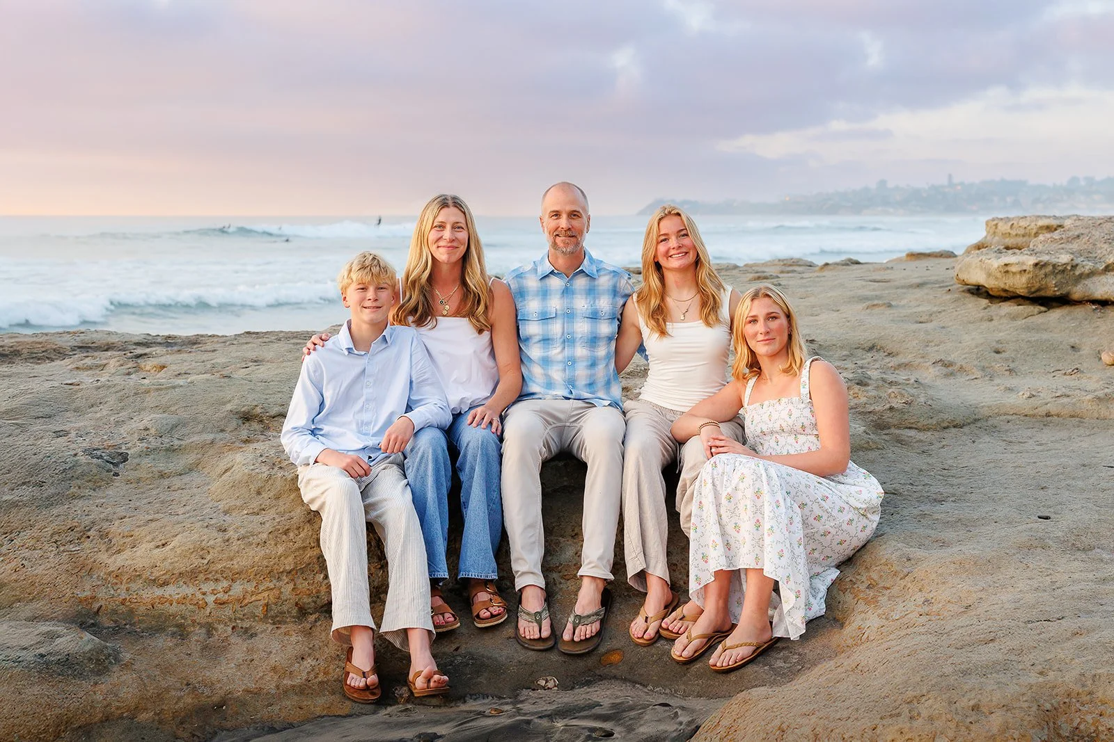
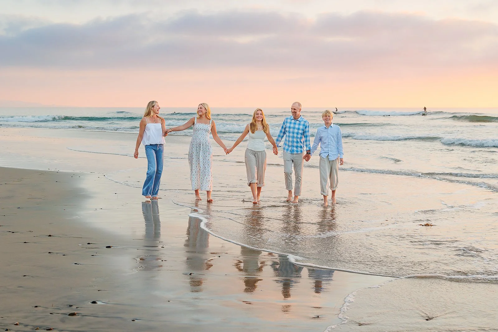
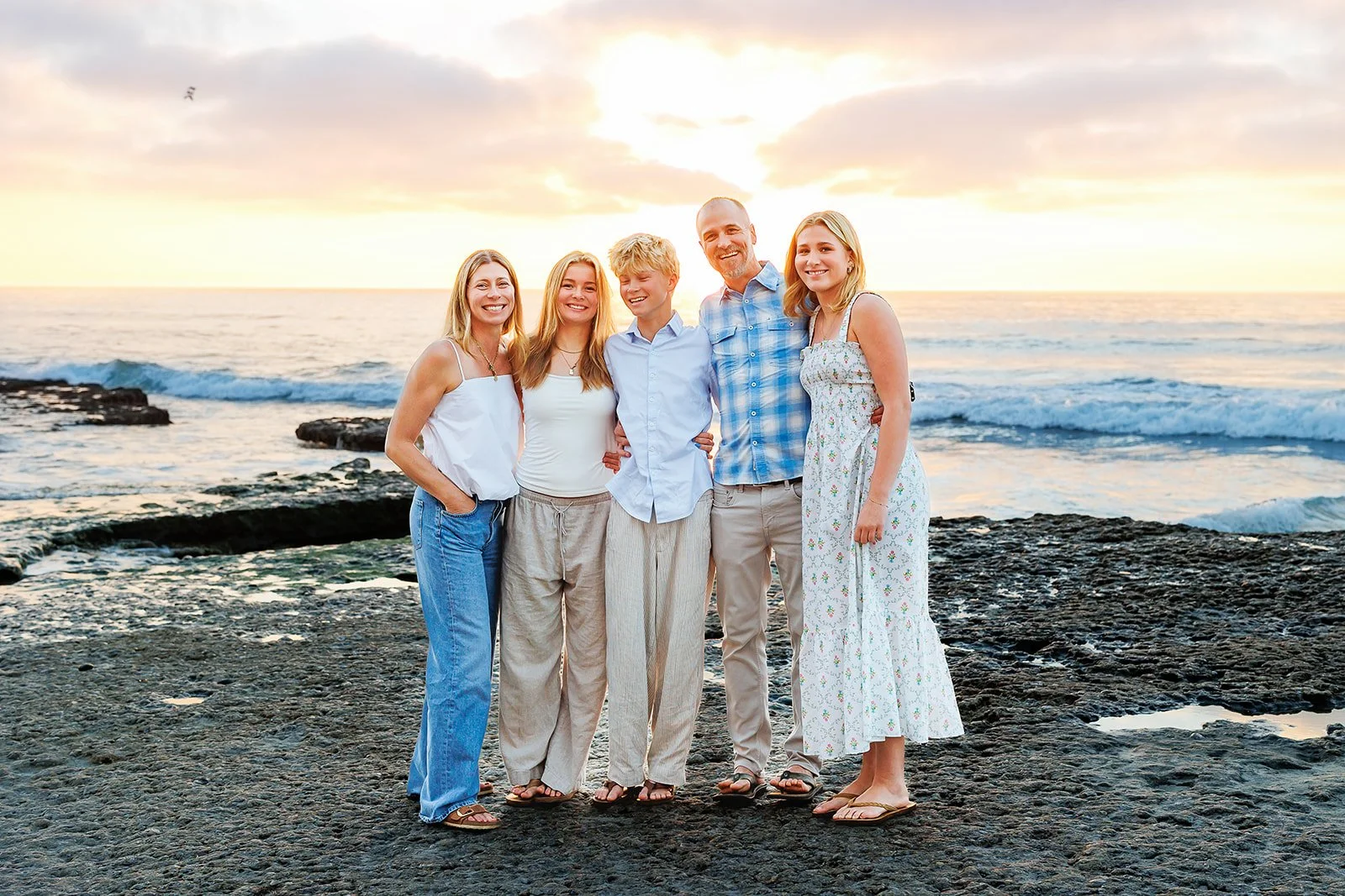
Same palette, very different outfits. That’s exactly what we mean by coordinating instead of matching.
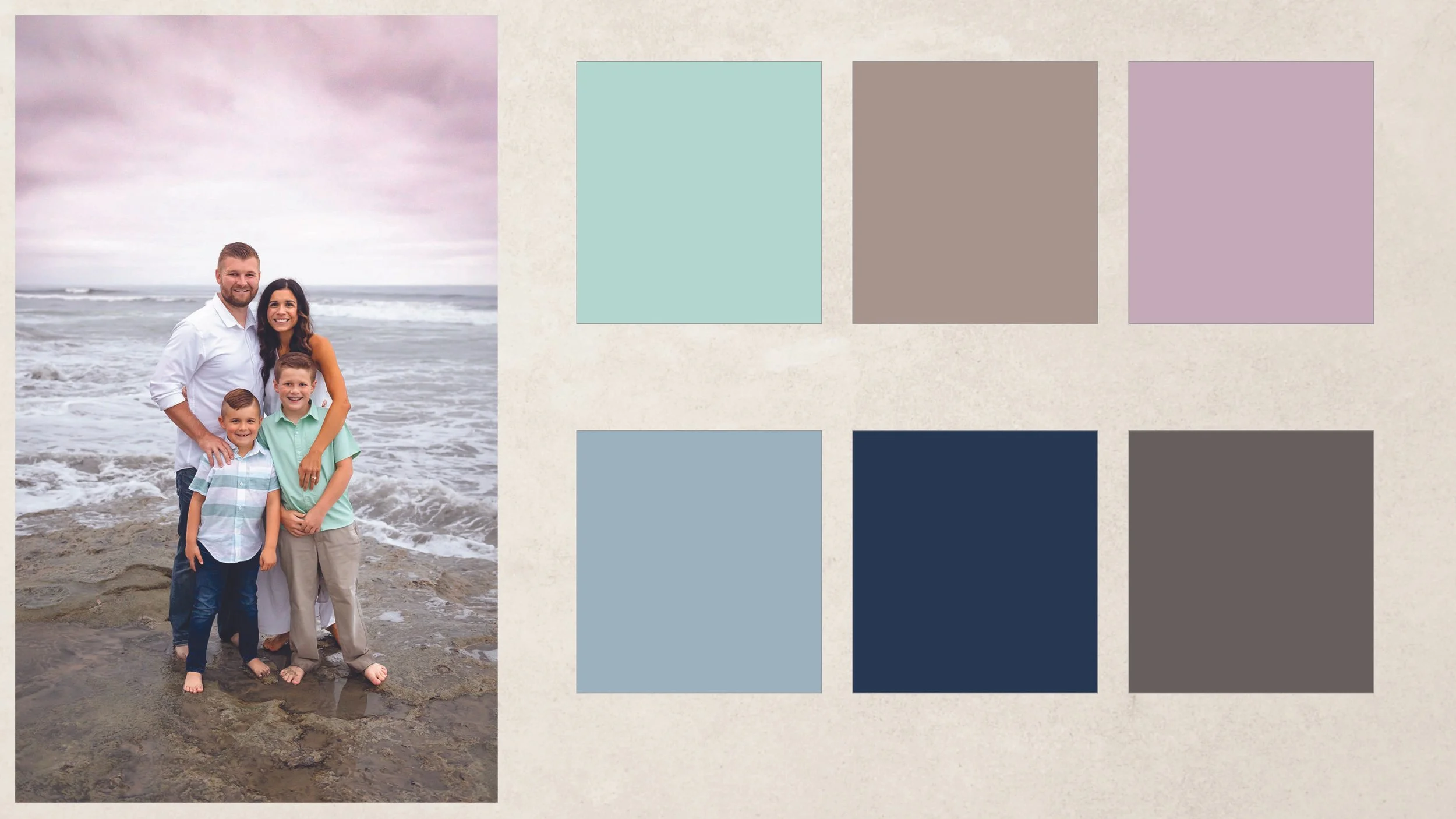
Soft & Coastal Palette
Think dusty blues, light teal or green, soft tans, cream, and sometimes a little pink, mauve, or blush—colors that naturally play off the water, sand, and sky.
Gray is an often-overlooked neutral that works especially well at San Diego’s rockier or grayer beaches.
And don’t feel like every color has to be super muted. Lighter beachy tones can absolutely mix with deeper denim, navy, or one brighter blue. That little bit of contrast keeps a coastal palette from feeling too precious while still tying beautifully into the scenery.
Warm & Earthy Palette
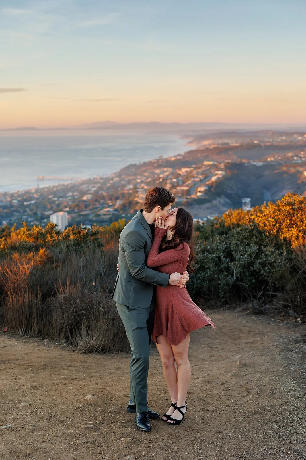
Warm & earthy doesn’t have to mean beige and brown. Rust, terracotta, muted green, deep teal, mustard, dusty rose, warm taupe, and softened browns can all feel incredible against golden coastal light. And you can absolutely use lighter versions of these same colors if richer tones aren’t your thing. Mustard can be a fun standout color, or soften it toward ochre for a quieter version of the same palette.
These richer tones photograph especially beautifully at sandy or warmer-colored locations. If your beach has cooler gray rocks, we usually balance those warmer colors with a greige, muted green, or another neutral that keeps the whole palette connected to the environment.
2. Let Your Home Be Your Guide
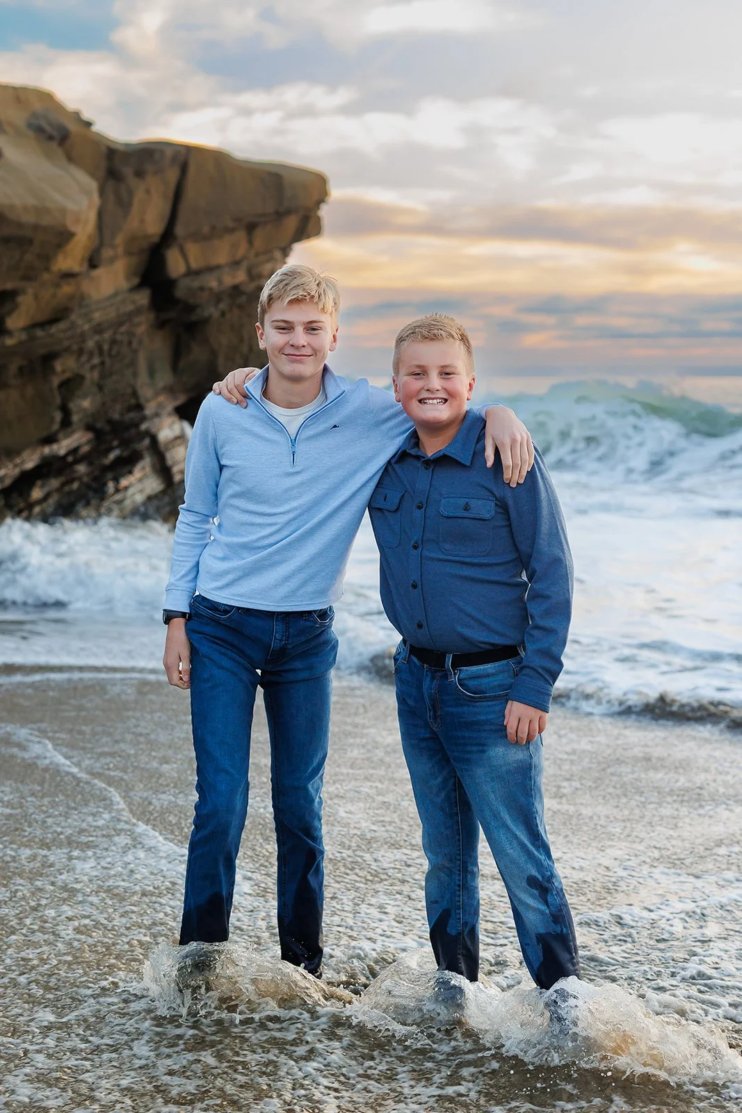
If you already know you’d love to print a large portrait for your home, let your decor help guide your palette.
You don’t need to match your house. Just think about what will complement it.
For example, with navy walls you might choose softer beachy blues, khaki or tan neutrals, and a little mauve or blush for warmth. The end result still feels natural at the beach while also making sense in the space where you’ll see your photos every day.
3. Choose Clothes That Move
Looking great starts with feeling great in what you’re wearing.
A beach session involves movement. You’ll probably walk, play, snuggle, sit in the sand, pick up your kids, and potentially get gently ambushed by a child tugging on your clothes approximately 30,000 times in 45 minutes.
Your clothes need to handle all of that.
Looser silhouettes are great at the beach because the fabric catches movement and breeze. Dresses that twirl are a particular favorite around here.
If you want some shape too, a maxi or midi dress that fits through the waist and opens into a looser skirt is a great option.
And your favorite jeans can absolutely work. You already know you can move comfortably in them. Add a textured top and a few accessories and they can feel relaxed without looking accidental.
Our simplest test? If you think it will catch the beach breeze well, it probably has the movement we’re looking for.
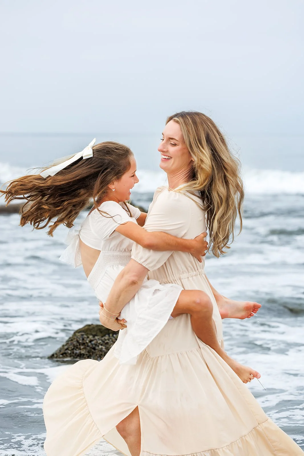
Mom’s skirt, her daughter’s dress, the ribbon, the hair—everything is moving here. This is exactly what we mean when we say clothes can contribute to the feeling of a photograph instead of just being something you happen to be wearing.
Test the Outfit First
Can you lift your arms? Sit comfortably? Swing your kiddo around without adjusting your clothes every five seconds?
Great.
For kids, take that test a step further. Have them actually run, jump, sit, climb, and play in the full outfit ahead of time. You want to discover the itchy tag, too-tight waistband, or slipping strap before photo day.
And if you see their undergarments during the test run, add bloomers, shorts, or a diaper cover. If you saw them, we will too.
Pay attention to the weather as well. Walking across loose sand is deceptively sweaty work, but temperatures can also drop quickly after sunset. Breathable clothes plus a photo-ready sweater or light layer usually cover both.
A Note for the Guys
That heavy long-sleeved button-down you save for dinners, holidays, and the occasional family photo probably isn’t automatically your best beach option.
Instead, try a short-sleeved button-down, lightweight knit, polo, or simple tee—something that lets you move and still works with the rest of the family.
And if the guy in your family wears jeans constantly, he doesn’t suddenly need to become Linen Shirt Beach Dad just because you booked photos. We’d rather start with clothes he actually feels like himself in and make them work with the palette.
Full-length pants are fine, but there’s a good chance they’ll be wet to mid-shin before we’re done.
Men’s shorts can look great too. Just make sure you like the length while sitting, standing, bending, and moving around—not just while standing in front of the mirror.
Let’s Talk About Shoes
Bring shoes to the beach, especially for kids. Hot sand and sharp rocks are no fun.
Once we’re actually in the sand, though, we usually leave them behind—so make sure your feet are photo-ready.
At rocky beaches you may need to keep shoes on longer, and if you do, expect them to leave the session looking a little rougher than when they arrived.
Flip-flops and water shoes are generally a no for photos unless we’re intentionally doing a swimsuit or lifestyle-style session. If shoes will stay on, make them part of the outfit rather than an afterthought.
And please have your kids try on their “nice” shoes ahead of time.
We once brought our son’s fancy shoes to our own family beach session only to discover they had become too tight. His little eight-year-old mood was understandably affected by toe-pinching shoes.
Learn from us.
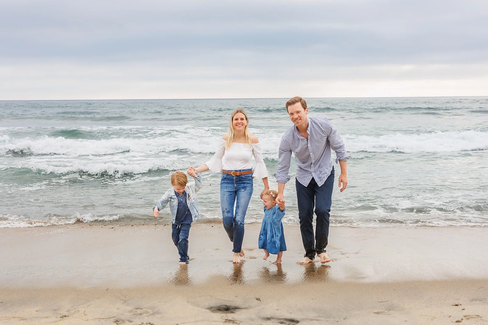
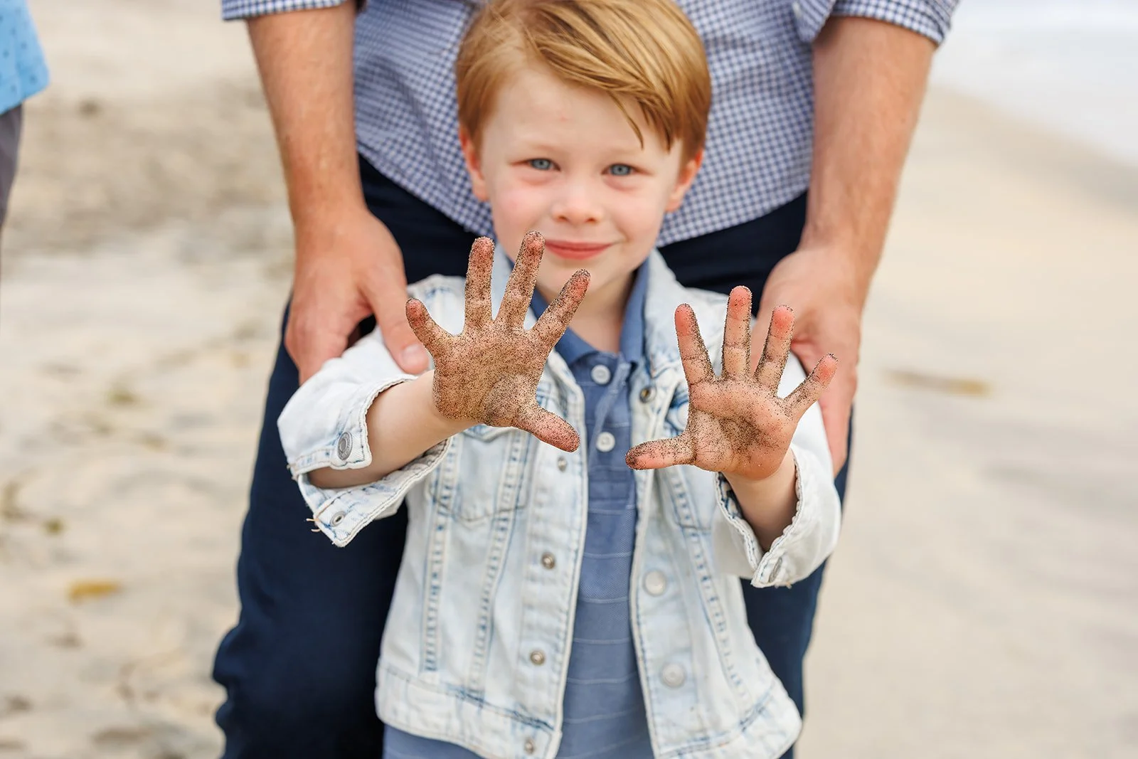
Exhibit A: when we say your pants might get wet, we mean it.
4. Incorporate Patterns, Texture & Personality
Solid colors make coordinating easy, but an entire family in flat solids can sometimes feel a little too safe. Patterns and texture give your outfits interest without requiring a bunch of competing colors.
As a starting point, keep noticeable patterns to one or two outfits. If you add more, keep them subtle and within your palette so they start to read more like texture than competing prints.
Rather than automatically adding another pattern, think about texture: gauze, linen, embroidery, open knits, lace, denim, waffle knits, and lightweight cotton can all give your outfits depth without adding another competing design.
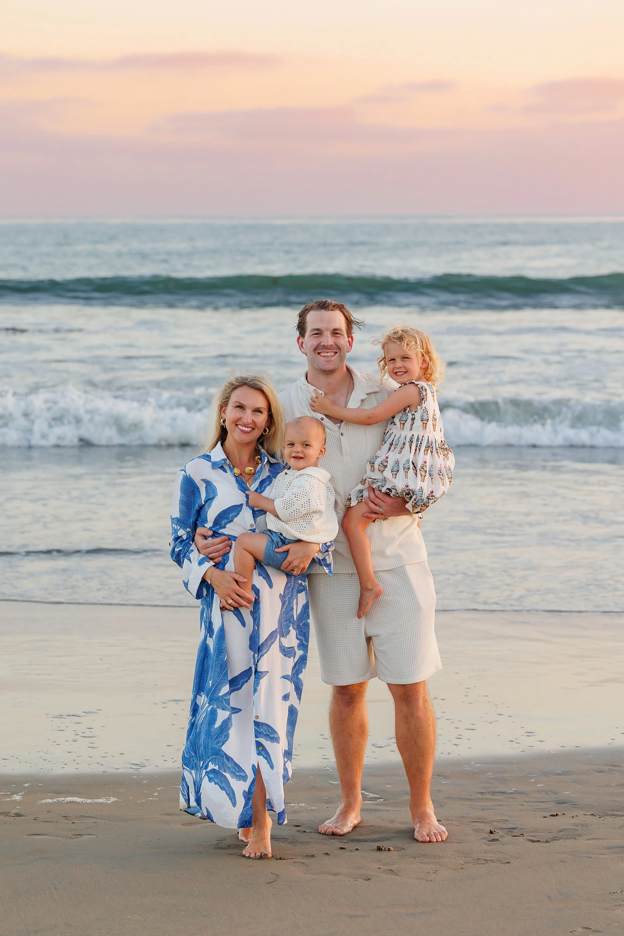
There are actually several patterns and textures happening here, but because they stay inside such a controlled palette, nothing is fighting for attention.
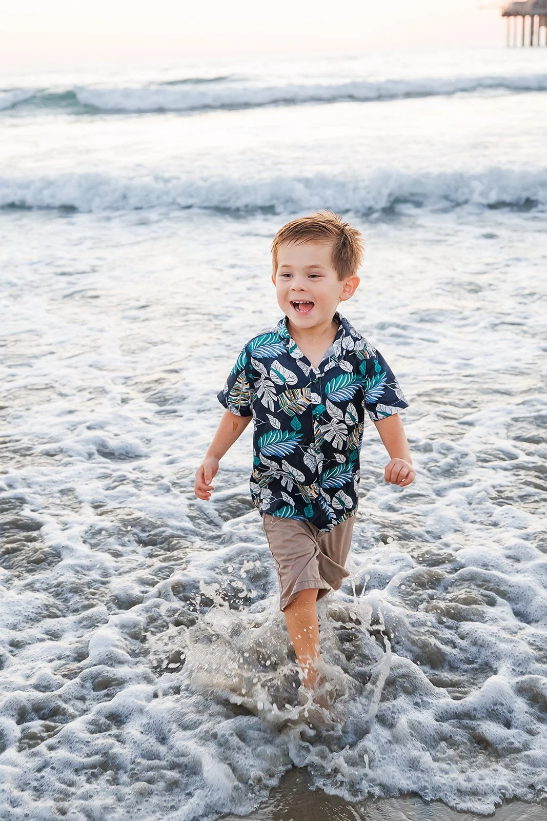
Larger patterns can also be really fun at the beach. You absolutely can go full Hawaiian-shirt mode if that’s your kid’s personality—we’d just let that bold piece be the star and keep the rest of the family a little quieter.
5. Please Still Look Like Yourselves
The goal is never to dress like a “beach photoshoot version” of yourself. We want you to look like the most relaxed, natural version of you.
Bold earrings, a favorite hat, your kid’s beloved boots, visible tattoos, signature jewelry, worn-in sneakers, a denim jacket—we want to work with the things that feel like you, not automatically hide them.
We’re very much in the “guidelines, not rules” camp.
We’d rather adjust everyone else around one piece you love than strip away all the personality for the sake of perfect coordination.
Our Go-To Beach Outfit Formulas
Soft & Coastal
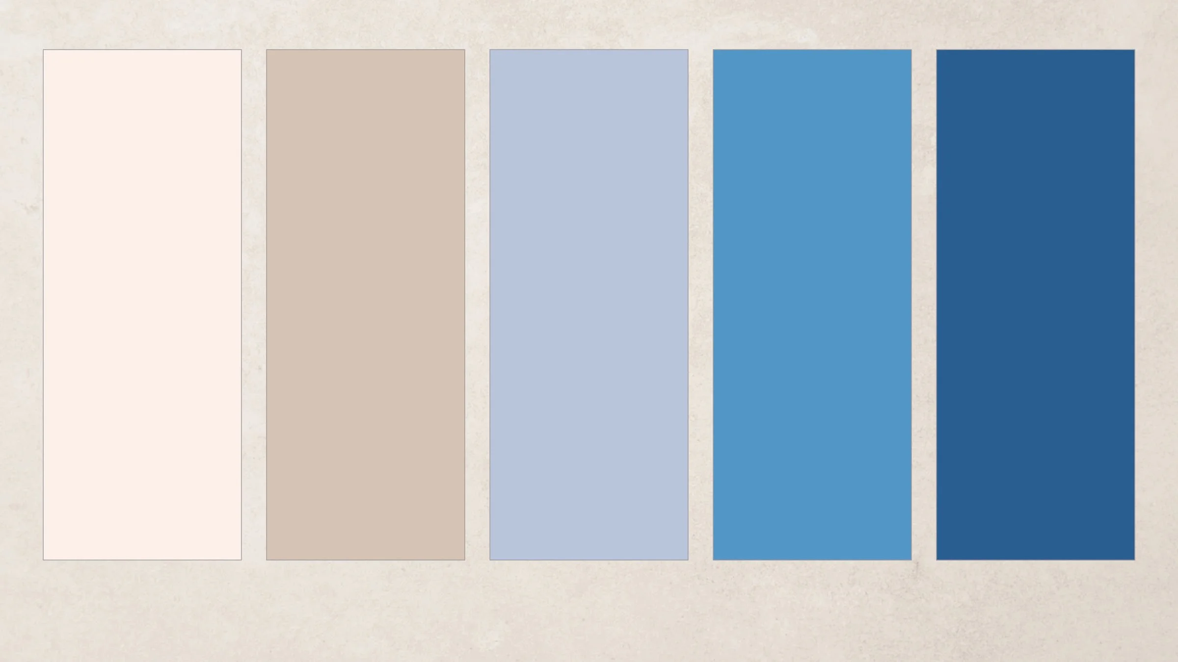
Blue & Ivory
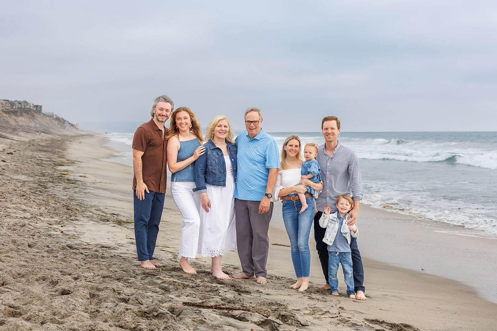
This version of soft & coastal leans into classic beach colors—blue, white, cream, and ivory—but keeps enough variation in tone, texture, and silhouette that nobody looks like they showed up in a matching family uniform.
Palette: ivory + cream + pale blue + medium coastal blue + deep blue.
Mom: An ivory-and-blue patterned midi dress with plenty of movement. A larger botanical or softly spaced floral would work especially well here and can act as the anchor for the rest of the family palette.
Dad: A medium or navy blue lightweight button-down with light khaki or greige pants or shorts. The deeper blue adds contrast and keeps the overall palette from becoming too pale.
Teen daughter 1: A solid pale-blue midi or maxi dress, ideally with some texture, gathering, smocking, or a tiered skirt so the solid color still has plenty of visual interest.
Teen daughter 2: Medium or light-wash jeans with a cream or ivory top. Look for a top with texture, soft drape, or a subtle detail rather than a completely flat basic. The denim keeps her outfit casual and age-appropriate while adding another shade of blue to the family palette.
Middle-school son: A light-blue button-down with khaki shorts or pants. Rolled sleeves can help keep the outfit relaxed and beachy rather than overly dressed up.
Why it works: The family is working within a pretty narrow color palette, but everyone still has their own look. The blues range from pale to deep, cream and ivory break things up, denim adds texture, and the warm khaki keeps everything from feeling too cool. Mom’s patterned dress provides a focal point while the rest of the outfits give the eye plenty of room to rest.
Sunset & Ocean Colors
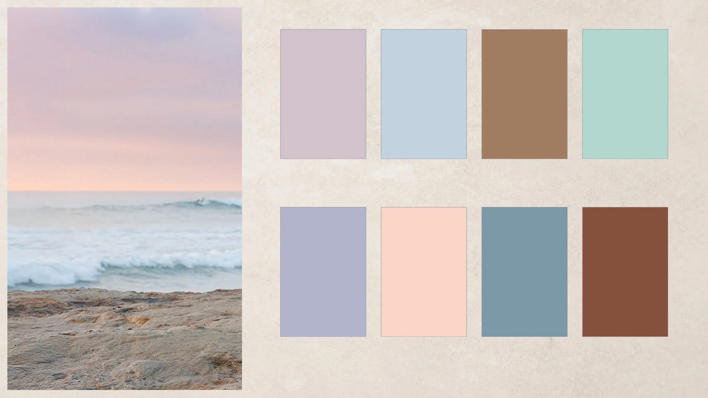
Palette: dusty blue + soft coastal blue + sea-glass green + blush/dusty rose + warm khaki
Mom: A flowy dusty blue midi dress with plenty of movement for walking, sitting, and playing on the beach.
Dad: A soft blue short-sleeve button-down that coordinates with Mom without matching her exactly. Pair with khaki, greige, or light tan shorts or pants.
Girl, age 8: A dusty rose sundress. We’d choose one of the patterned options for this dress rather than a solid—the print gives the family a focal point while still staying within the soft coastal palette.
Boy, age 5: A soft green cotton polo with simple khaki shorts. The green pulls in another color from the palette while the neutral bottoms tie back to Dad.
Why it works: Everyone is pulling from the same soft coastal palette, but nobody is wearing the same outfit. The girl’s patterned dress adds visual interest, while the remaining pieces stay mostly solid and rely on color and texture to keep the whole family cohesive.
Warm & Earthy
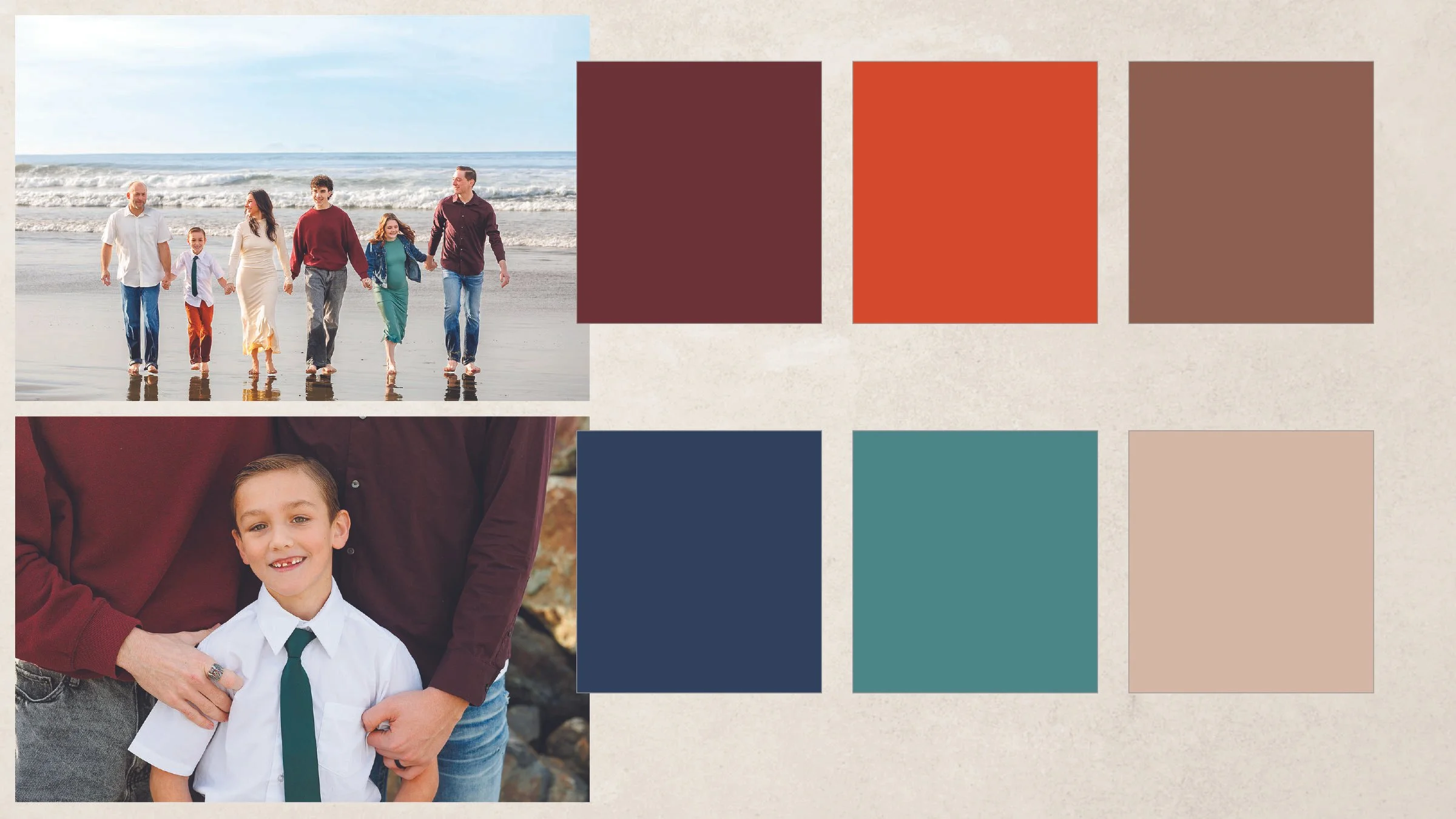
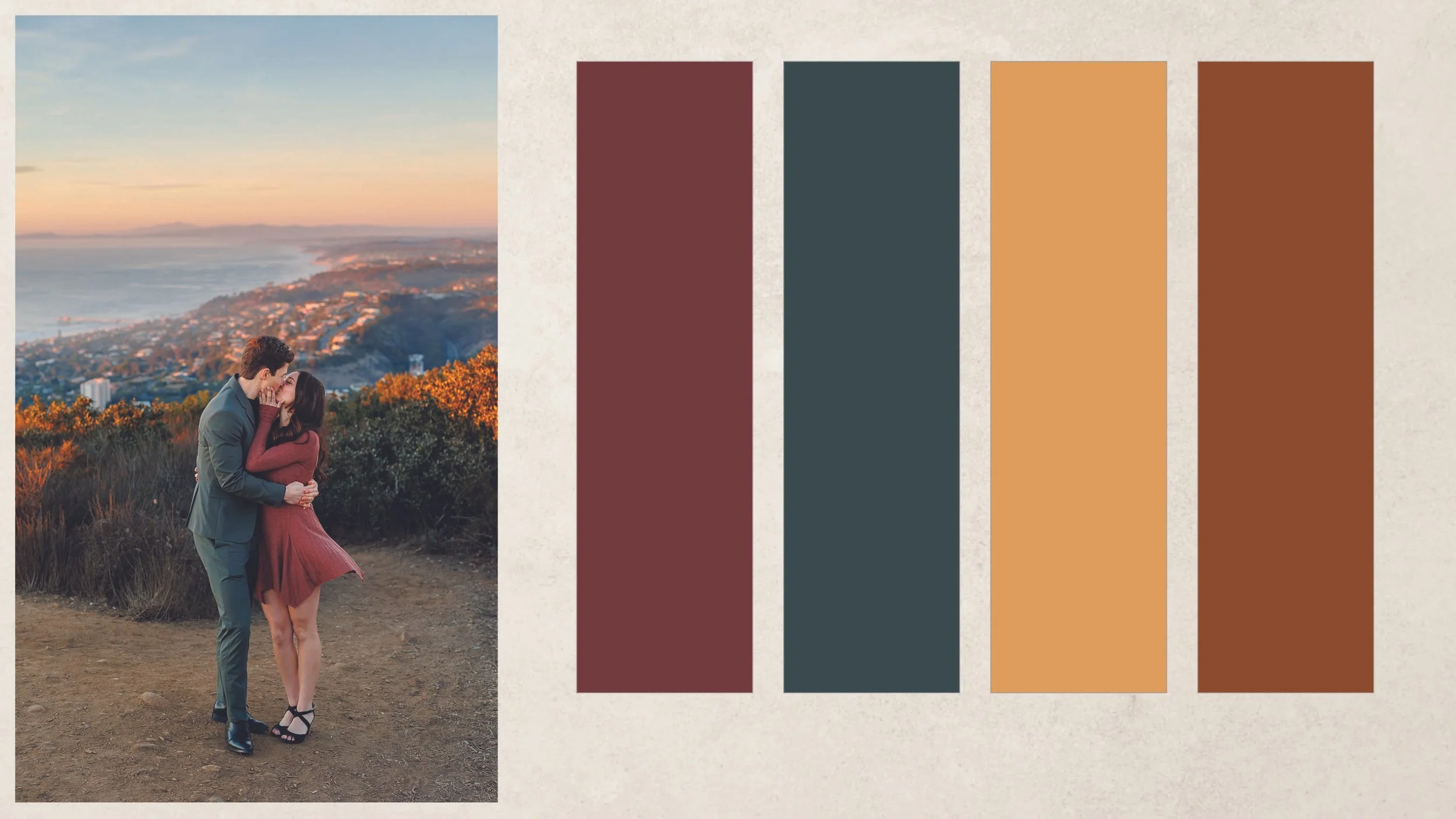
This palette is all about richer color without feeling heavy. Think muted greens, rust, warm ochre, and cognac, with enough variation in texture and value that the family still feels layered rather than overly coordinated.
Palette: burgundy/rust + deep muted green + warm ochre + cognac + a little cream/ivory to give everything room to breathe.
Dad 1: A deep muted green short-sleeve button-down or lightweight knit polo with warm tan or khaki pants. We like the green here because it gives us one of the strongest colors in the palette while the neutral bottoms keep it easy and beachy.
Dad 2: A rust or burgundy lightweight shirt with medium-wash denim or warm brown/khaki pants. We’d keep his silhouette different from Dad 1 so the two outfits coordinate without looking like a set.
Boy, age 2: A warm ochre or mustard knit/Henley-style top with soft brown, camel, or tan shorts. At this age, we’d prioritize something comfortable enough to run, sit, climb, and get sandy in without anyone worrying about the outfit.
Baby girl: A cream or warm ivory textured romper or dress with a tiny rust, ochre, or muted-green print. We’d keep her lighter than everyone else so she doesn’t get visually lost when she’s being held, while the small pattern pulls the whole family palette together.
Why it works: The dads carry the deeper colors, the toddler brings in the warm golden tone, and the baby gives us a lighter visual break. Nobody is wearing the same color, but every outfit relates back to the same earthy palette. The mix of solids, denim or khaki, and one small pattern keeps it colorful without becoming busy.
Casual & Colorful
We love color! But even we can admit that sometimes too much color is...too much color.
For this look, we’d start with one or two stronger colors and build around them with quieter tones, denim, cream, tan, or another neutral. The goal isn’t to make every person wear a different bright color—it’s to let the family feel colorful without having every outfit compete for attention.
We also like using different depths of color instead of keeping everything equally bright. Deep teal, muted rust, soft denim, warm cream, and one brighter accent can feel much more natural than five equally saturated colors.
Say your son is absolutely determined to wear his favorite peacock-purple shirt. Great. Build from there. Pull one or two related colors into the rest of the family, then give them some breathing room with denim and neutrals.
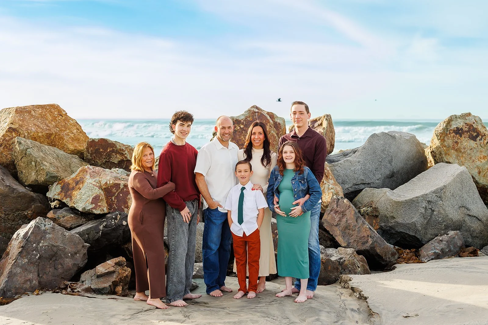
Palette: Choose 2–3 stronger coordinating colors + denim, cream, tan, or another neutral.
Mom: A rich teal, berry, rust, or patterned midi dress with movement.
Dad: A soft neutral or denim-toned shirt with khaki or medium-wash jeans, depending on how casual you want the overall look.
Child 1: A stronger color pulled from Mom’s dress or pattern.
Child 2: A quieter coordinating shade or neutral so the kids aren’t both acting as focal points.
Why it works: The neutrals give your eye somewhere to rest, while the stronger colors keep the family from feeling too safe or overly styled. It’s especially good for families who naturally wear more color and don’t want their photos to feel like a beige version of themselves.
A Few Things We’d Skip
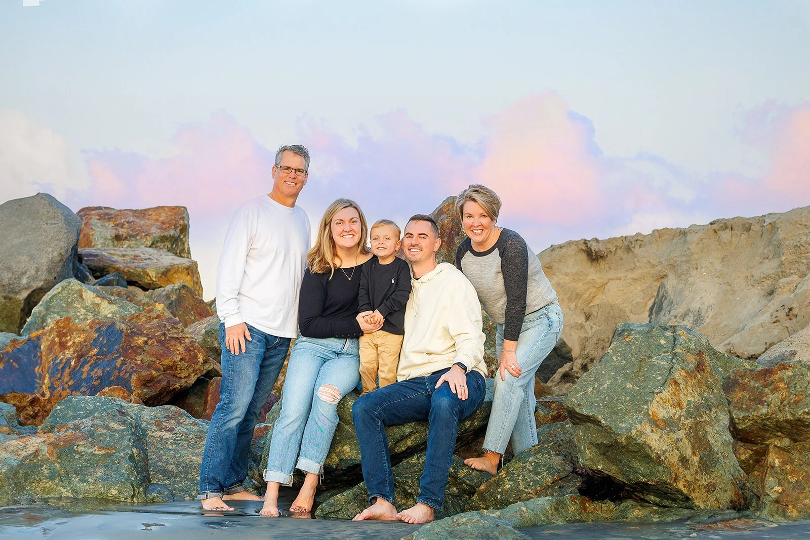
A Lot of Black
Black can feel heavy against the softer colors of the beach, especially if the entire family is wearing a lot of it.
That does not mean that if half your closet is black, you need to suddenly show up dressed like a beige person because a photography blog told you to.
If black feels like you, use it. We generally like it best mixed with lighter neutrals, denim, texture, or other colors instead of making every outfit dark from top to bottom.
Deep brown, charcoal, navy, and other rich neutrals can also give you that darker feel while working beautifully with the beach environment.
Everyone in White Tops
Let’s address the classic white-shirts-on-the-beach look.
White can be beautiful, especially as one element of a larger palette. But an entire family in bright white can be tricky at the beach.
Beaches have a LOT of reflective surfaces—the water, sand, rocks, cliffs, and open sky. Bright whites can lose detail in all that light, and because environmental colors are bouncing around too, white clothing can easily pick up blue, green, gold, or orange casts.
When everyone is wearing white, you can also lose some of the visual layering that helps each person stand out when we bring you all in close.
So white isn’t forbidden. We just like it better as a supporting player than the main event.
Cream and ivory are also great alternatives if you want that light, neutral feel with a little more softness.
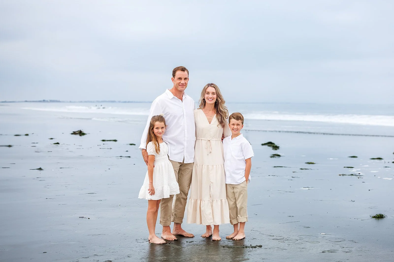
This family is a great example of why we love mixing white with cream and warmer neutrals. Three people are wearing quite a bit of white, but Mom’s ivory dress, her daughter’s softer cream dress, and the khaki pants break everything up just enough to give each person their own shape while keeping the whole palette beautifully light.
Everyone Wearing the Same Thing
Matching can be adorable, but in family photos it can also cause everyone to visually blend together.
When we smoosh you all in close—and we absolutely will—we still want to see the individual people, textures, and layers within the group.
Repeating colors? Absolutely.
Four identical white shirts and khakis? We can probably do better.
Anything You Don’t Feel Comfortable In
If you’ll spend the whole session pulling something down, tugging something up, sucking something in, worrying about a strap, or telling your child not to mess up their clothes, it probably isn’t the right outfit.
The best clothes are the ones you can mostly forget about once the session starts.
The Actual Most Important Rule
At the end of the day, we want these photos to look like your family.
None of this advice is meant to turn you into a perfectly coordinated beige-and-blue Pinterest family. It’s meant to remove distractions so the love, joy, connection, and personality you bring with you can take center stage.
And if you’re stuck, send us your ideas. Screenshots, outfit photos, or even the one piece you know you want to build everything around are all welcome. Ideally, send them a few weeks before your session so we have time to make adjustments without last-minute scrambling.
Don’t overthink this. If everyone feels comfortable, looks like themselves, and is ready to play together on the beach, you’re already most of the way there.
Start with what you already own—you already know those pieces look good on you—stick with your palette, and then buy only what you need to round out the vision.